
The digital marketing landscape is constantly evolving; email marketing stands as one of the mutually beneficial strategies that businesses can take advantage of to reach out to their customers, build trust, and grow their sales. It provides companies with a first-hand experience in communicating updates, selling products, and establishing relationships with customers. But inboxes are busier than they’ve ever been, and trying to get emails noticed is tougher than ever. If it’s just great content, that’s not enough anymore. Users make a decision to open, read, or delete an email within a few seconds. Professional graphic design gets the job done! Using a clean layout, great visuals, easy-to-read fonts, and clear CTAs (call-to-action) buttons makes emails more interesting and digestible. Clearly, well-designed emails can help to improve the brand and to influence recipients to take the desired action.
Why Email Marketing Still Delivers Excellent
Email Marketing Remains One of the Most Compelling Digital Channels
- One of the best ROI (return on investment) compared to most other Digital marketing for real estate firms in New York channels.
- Offers one-to-one communication with customers, with a personal inbox experience.
- Enables personalized marketing through data on customers’ preferences, purchase history, etc.
- Optimizes open rates, click-through rates, and conversions through targeted campaigns.
- Communicates consistently with customers to strengthen relationships through relevant communication.
- Improves customer retention by keeping audiences informed, engaged, and connected with the brand.
- Encourages repeat purchases and long-term customer loyalty through regular follow-up emails.
The Growing Importance of Visual Content in Emails
- Gets to the point in today’s shortened attention spans.
- Answers to a visual audience, which prefers images over loads of content.
- Makes emails easier to scan and understand within seconds.
- Increases brand recognition through using consistent colors, logos, design elements, etc.
- Increases engagement with the email by getting the reader to spend more time with it.
- Uses eye-catching format and clean “call to action” buttons to highlight key information.
- Creates a professional impression that builds trust and credibility.
- Opens more emails and improves conversions by making emails more engaging and calls to action more effective.
Why Graphic Design Matters in Email Marketing
Creates Strong First Impressions:
You only have a few seconds to get someone’s attention in their email. A neat design, beautiful photographs, and colors that are not overwhelming are all good signs that make your readers want to read on. By using professional graphic design, you ensure that your email is noticed in a crowded email inbox, which will lead to higher open rates, better engagement, and increased interest from your customers from the start.
Improves Readability and User Experience:
Good graphic design makes email content easier to read and understand. Clear headings, readable fonts, proper spacing, and organized sections guide readers through the message without confusion. Mobile-friendly designs, strategically placed graphics, and easy-to-understand call-to-actions help improve user experience and make it easier for users to discover and respond.
Strengthens Brand Identity:
Businesses can ensure their brand colors, logos, typography, and even the visual style are used consistently so customers can instantly recognize your business. Each and every email contributes to your brand identity and enhances familiarity. This consistency can build brand recognition, enhance recall, and aid in better long-term relationships with your audience.
Builds Trust and Professionalism:
A well-conceived email will demonstrate your company cares about quality and details. Neat graphics make up for credibility and conceptual clarity. Polished and consistent email messages help build subscriber trust in your brand, encourage them to interact with your message, and confidently take the action you’re asking them to.
Essential Graphic Design Elements for Successful Email Campaigns
Eye-Catching Header Images:
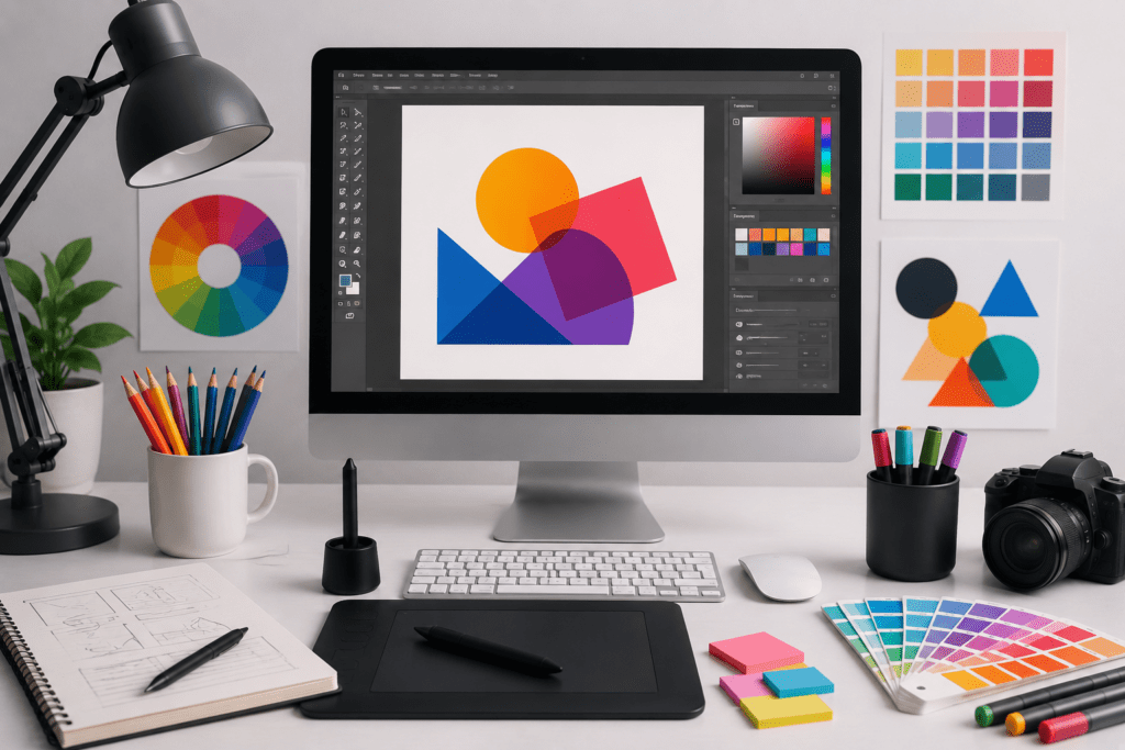
The header image is the first visual element readers notice after opening an email. It should immediately communicate the purpose of the message while matching your brand identity. Use high-quality, relevant visuals that support your campaign and stimulate readers to continue scrolling through the rest of the content.
Consistent Brand Colors:
Using the same color palette across every email builds familiarity and strengthens brand recognition. Consistent colors create a professional appearance, improve visual harmony, and help subscribers instantly identify your business whenever they receive your marketing emails.
Easy-to-Read Typography:
Choose clean, readable fonts with appropriate sizes for both desktop and mobile devices. Clear headings, short paragraphs, and strong text contrast improve readability, helping subscribers quickly understand your message without feeling overwhelmed by large blocks of text.
Balanced White Space:
White space gives your content room to breathe and prevents emails from looking cluttered. Proper spacing between images, text, and buttons improves readability, directs attention to important information, and creates a cleaner, more professional design.
High-Quality Product or Service Images:
Sharp, professional images showcase your products or Email Marketing services in the best possible way. Avoid blurry or oversized graphics that reduce credibility. Relevant visuals help explain your offer faster, increase customer confidence, and encourage users to explore your website or make a purchase.
Mobile-Friendly Layout Design:
Most emails are opened on smartphones, making responsive design essential. Use flexible layouts, properly sized images, readable text, and touch-friendly buttons to ensure every subscriber enjoys a smooth experience across all screen sizes.
How Good Design Improves Email Conversion Rates
Encourages More Clicks:
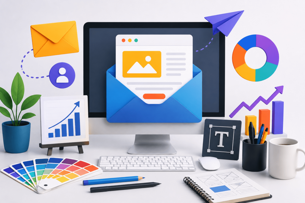
A well-designed email naturally guides readers toward the most important action. Clear headings, attractive visuals, and strategically placed call-to-action buttons make it easier for subscribers to understand your message and click through. Simple navigation and organized content reduce confusion, helping businesses achieve higher click-through and conversion rates.
Reduces Bounce and Unsubscribes:
Poorly designed emails can overwhelm readers and cause them to leave without taking action. Clean layouts, readable text, and mobile-friendly formatting create a better user experience. When subscribers receive visually appealing and valuable emails, they are less likely to ignore messages, unsubscribe, or lose interest in future campaigns.
Increases Customer Engagement:
Professional graphic design keeps readers interested from the beginning to the end of an email. Engaging visuals, balanced spacing, and easy-to-read content encourage subscribers to spend more time reading your message. Increased engagement often leads to more clicks, website visits, product inquiries, and stronger interactions with your brand.
Builds Long-Term Customer Loyalty:
Consistent, high-quality email design creates a reliable and professional brand experience. When customers regularly receive attractive, informative, and easy-to-read emails, they develop greater trust in your business. Over time, this positive experience strengthens customer relationships, encourages repeat purchases, and builds long-term loyalty that supports sustainable business growth.
Common Graphic Design Mistakes to Avoid in Email Marketing
Even the best email content can fail if the design creates a poor user experience. Avoiding these common graphic design mistakes helps improve engagement, readability, and conversion rates.
Overcrowded layouts: Filling an email with too much text, too many images, or excessive design elements can overwhelm readers and make important information difficult to find.
Using too many colors: A large variety of colors creates visual confusion and weakens brand consistency. Stick to a simple coloring palette that matches your brand identity.
Large image files: Oversized images increase loading times, especially on mobile devices. Compress images without sacrificing quality to improve performance.
Poor mobile optimization: Since many users read emails on smartphones, unresponsive layouts, oversized images, and difficult navigation can reduce engagement and increase abandonment.
Tiny fonts: Small text is difficult to read, especially on mobile screens. Use clear, readable font sizes with enough spacing for a comfortable reading experience.
Weak call-to-action (CTA) buttons: Small, poorly placed, or unclear CTA buttons make it harder for readers to take action. Use bold, visible buttons with action-oriented text.
Inconsistent branding: Different fonts, colors, logos, or design styles across campaigns can confuse subscribers. Consistent branding builds recognition, trust, and a more professional image.
Best Practices for Combining Email Marketing and Graphic Design
To create successful email campaigns, combine effective marketing strategies with thoughtful graphic design that enhances the user experience.
Keep layouts simple: Use clean, organized designs that help readers concentrate on your message without unnecessary distractions.
Use visual hierarchy: Arrange headings, images, text, and call-to-action buttons in a logical order so readers naturally follow the content.
Optimize images: Compress pictures to improve loading speed while maintaining high quality for a better viewing experience.
Maintain branding consistency: Use the same logo, colors, fonts, and design style across every email to strengthen brand recognition and trust.
Test different designs: Conduct A/B testing with layouts, colors, images, and CTA buttons to determine what delivers the best engagement and conversion rates.
Personalize visuals: Include relevant images, product recommendations, or promotional banners based on customer preferences and behavior to make emails more meaningful.
Design for accessibility: Use readable fonts, strong color contrast, descriptive image alt text, and mobile-friendly layouts so every subscriber can easily access and understand your content.
Bringing It All Together
Email marketing remains one of the most effective Digital marketing for doctors in Manhattan strategies, but its success depends on more than strong written content. Professional graphic design helps emails capture attention, improve readability, strengthen brand identity, and encourage readers to take action. Attractive visuals, user-friendly layouts, clear call-to-action buttons, and consistent branding work together to increase engagement, click-through rates, and conversions. A well-designed email also creates a positive customer experience that builds trust and sustains long-term loyalty. Businesses that invest in professional email design can create more impactful campaigns, improve overall marketing performance, and achieve better results from every email they send, making graphic design an essential part of every successful email marketing strategy.
FAQs
1. Why is graphic design important in email marketing?
Graphic design makes emails more attractive, easier to read, and more engaging. It helps capture attention, strengthens brand identity, improves user experience, and encourages subscribers to click, interact, and complete desired actions.
2. How do images improve email engagement?
High-quality images quickly capture attention, explain messages visually, and make emails more appealing. Relevant visuals increase reader interest, improve content understanding, and encourage higher click-through rates and customer engagement.
3. What colors work best in marketing emails?
The best colors match your brand identity while providing strong contrast for readability. Use a limited color palette, highlight important elements, and choose clear, consistent colors that guide readers toward call-to-action buttons.
4. How can I make my emails mobile-friendly?
Use responsive layouts, readable font sizes, compressed images, touch-friendly buttons, and short paragraphs. Always test emails on different devices to ensure they display perfectly and provide a smooth user experience.
5. What is the ideal email layout for higher conversions?
An effective email layout includes a strong header, clear headline, engaging visuals, concise content, balanced white space, and a prominent call-to-action button that guides readers toward the desired action.
6. What are the most common email design mistakes to avoid?
Common email design mistakes include cluttered layouts, too many colors, oversized images, tiny fonts, weak call-to-action buttons, poor mobile optimization, and inconsistent branding. Avoiding these issues improves readability, engagement, and overall campaign performance.